The Psychology of Colors: Mood and Perception with Best Painters in Hawaii
One of the easiest and most affordable ways of transforming your space into a refreshing new look is through a splash of color. But what is it about these eye-catching visuals that alter one’s perception and mood with just one look or entrance of a space filled with it?
Here our seasoned experts at Premier Painters Hawaii will talk about the different hues they have often worked with and how these colors affect their clients, both in residential and commercial settings, one paintbrush at a time.
Red
This rich, warm color often signifies passion, energy, and intensity. While this hue can stimulate the rise of excitement it can also produce feelings of anger and danger depending on the shades. Some of the best places to incorporate red would be in spaces that are made to hold and keep the flow of movement such as living rooms and commercial projects like retail stores where energy stimulation is encouraged.
Blue
Known for the calm and sea-like serenity that comes with it is the color blue. This color enhances productivity in the work environment, creating a calm space suitable for corporate offices, spas, and residential areas that want relaxation to be the prime mood as you enter the room.
When it comes to commercial and office settings, the color blue is linked to professionalism, trust, and reliability. It encourages focus, and productivity and improves mental clarity which makes this hue ideal for offices, study rooms, and conference rooms where ideas are nurtured.
Yellow
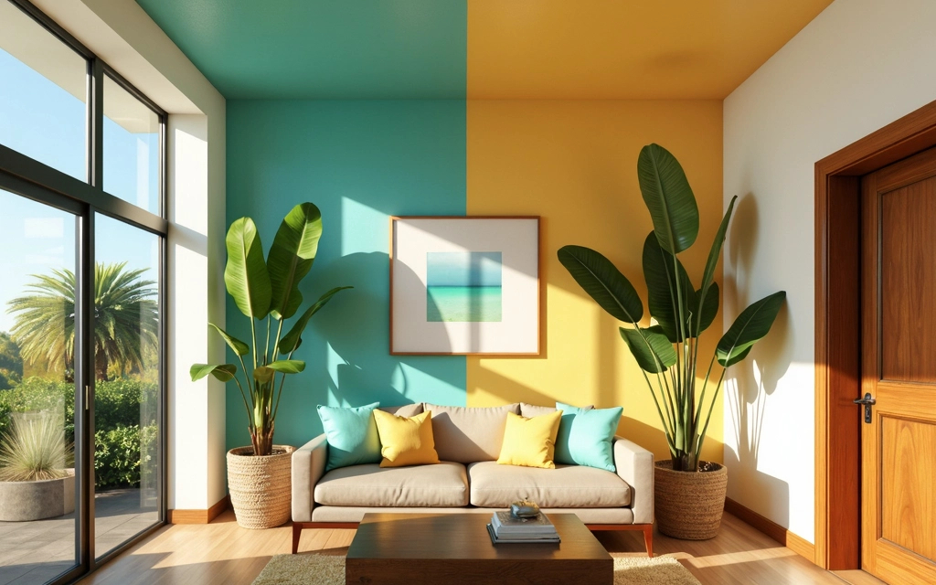
This color brings out happiness and positivity as you enter the area. Because of its vibrant eye-catching hue, yellow can be used for window displays in commercial retail to attract attention and in spaces where people gather like restaurants, cafes, and kitchens where the color yellow evokes the feeling of welcome and warmth.
And because it is lighter and less intense to its sister colors red and orange, the color yellow is often used in spaces that promotes joy and excitement, bringing in a perky and warm emotion with the more toned down feeling of energy that doesn’t at all lessen it’s dynamic vibrancy.
Green
Oftentimes, when green is used to color a surface, it is to blend the essence of nature into the modern structure to create a harmonious balance that can produce the same feeling of serenity and life to anyone who enters the room. Also known as the
color of life
because of its relation to nature and its conveyance to freshness and health, it can be incorporated into spaces that align with its representation such as hospitals, spas, and food establishments.
Using the color green in spaces that promote the sense of concentration and focus such as offices can also help reduce eye strain with its light and tranquil hue.
Purple
The different shades of purple can bring out different emotions once the eyes have laid on them, from its deep and rich shade to the light softness of soothing lavender, purple is a unique hue that can bring out feelings of relaxation, luxury, and mystery. In artistic spaces especially where imagination and innovation thrive, purple is a popular choice as it adds depth and character with its bold statements or subtle accents.
Orange
If you’re looking for a color that instantly captures attention with its dynamic energy then Orange is the hue you’re looking for. Adding orange to spaces boosts fun, warmth, and excitement, instantly transforming your room or surfaces into a lively environment. Whether it’s an accent wall in a living room, a vibrant splash in a kitchen, or a bold statement in a commercial space, orange draws attention and radiates positivity.
Black
Shades of black have always been associated with elegance and rich sophistication when used as a backdrop to balance accented hues or standalone to create an intense mood in specific spaces.
In modern interior design, the color black is often associated with minimalism and contemporary styles. This hue commands attention and refinement to a space, making it ideal for areas such as upscaled living rooms, home offices, or high-end retail spaces that want to leave a bold statement.
White
The color white often represents purity, cleanliness, innocence, and simplicity. The color white does not distract the eyes, making it the ideal color choice for spaces where focus and productivity are best promoted. It is the best background for merchandise and artwork and even cleanliness to stand out the most, a hue to accent colors and like black, provides a harmonious balance between colors.
Soft Pastels
When soft pastels come to mind, one often thinks of delicate, warmth, and comfort which is why these colors are often used in nurseries or spaces that promote a subtle elegance and a gentle uplifting of one’s mood. These colors are also easy on the eyes which encourages focus, creativity, and productivity within its welcoming air.
Nude Colors
Colors such as taupe, beige, and soft browns bring out feelings of warmth in a cozy atmosphere. These versatile colors are ideal for spaces that want to enhance the appearance of their furniture or boast sophistication and elegance in their subtle warmth, Nude colors cannot only tone down the vibrancy of bright hues but also lower intense emotions within people who enter the space. Feel free to
message us for more info.!
